A balloon brief you can send
Please use [main color] for most of the arrangement, [supporting color] for smaller groups and [accent] sparingly. Please send a physical swatch or a daylight photo beside my invitation before ordering.
From the QDP paper cupboard
Choose the paper before the palette
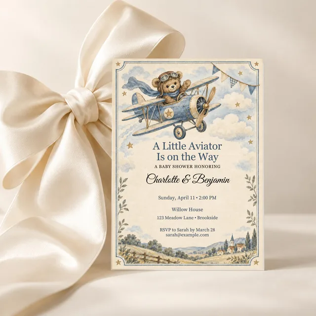
Find an invitation you love, save it to your party board, and keep that exact artwork as your reference while planning.
Explore selected invitationsThe party, at a glance
A plan to make your own.
- Begin with
- Your chosen invitation and the actual room.
- Choose in person
- Compare physical samples in the light you will use.
- Remember
- Palette percentages describe visual balance, not balloon counts.
Read the invitation in three passes
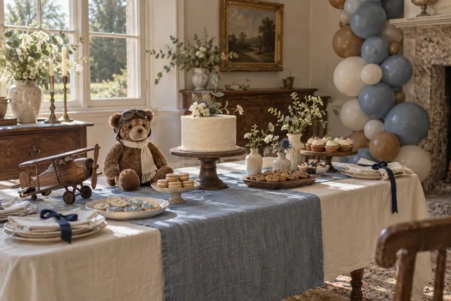
First, notice the color that makes you recognize the design. In Vintage Aviator Teddy, dusty blue carries much of that identity. Next, look for the quiet background that lets the illustration breathe: warm ivory or parchment often plays this role. Finally, find a small dark or rich detail that gives the paper definition.
Write those three jobs on your planning sheet: main color, soft background, finishing accent. This is more helpful than collecting five shades without deciding which matters most. You can bring other invitation colors into ribbon, flowers, or furniture rather than buying every shade as a balloon.
Count the room as part of the palette
A brick wall, navy curtain, or honey-colored dining table already contributes color. Take a photograph of the proposed display area during the part of the day when guests will be there. Look at the invitation beside that photograph and decide where you need contrast.
If the room is warm and dark, a generous amount of ivory may help the invitation colors remain visible. Against a pale wall, a deeper accent can give the display more shape. Keep doorways, windows, and the cake position in your sketch. The colors need to work around the room’s useful features.
Try the smaller color edit first
A five-color inspiration palette gives you choices across the whole party. A balloon arrangement can often use just three of them. For the Aviator mood, begin by comparing dusty blue, warm ivory, and toffee. Let a navy ribbon or dark serving tray supply the stronger contrast elsewhere.
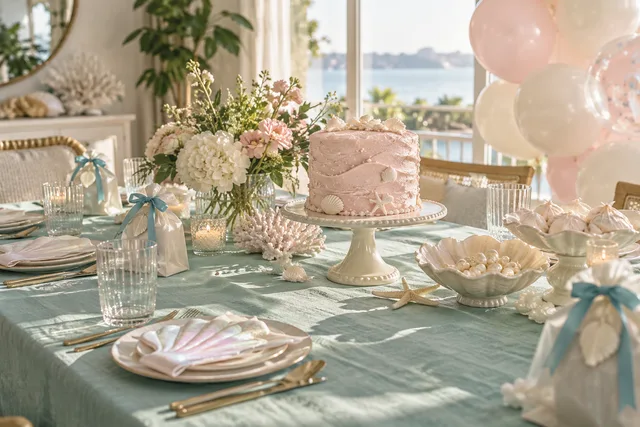
For Mermaid, sea glass, pearl, and shell pink make a softer group; a little lagoon blue can sit in paper details. For Pink Woodland, compare blossom, parchment, and moss. These are QDP styling suggestions, not manufacturer color names. Add another balloon color only when it has a clear role in your actual arrangement.
Make one physical sample comparison
Compare the printed invitation, a napkin, and balloon samples under the light you expect to use. Ask your supplier how to assess its finishes and colors before ordering a large quantity. A name such as “dusty rose” is not a reliable match across brands, and a screen cannot show every finish accurately.
Photograph the samples together as a reference for yourself or your stylist. If a metallic shade draws all the attention, decide whether that is the effect you want. You might prefer to carry that color in a small ribbon or printed detail. Keep the product label with each sample so you can order the one you actually liked.
Use the percentages to talk about emphasis
The percentages on QDP’s collection palettes suggest how much visual attention each color receives across a look. They are not balloon quantities, garland recipes, or a guarantee of how a supplier’s kit will appear. Balloon size, finish, spacing, and placement all affect what the eye notices.
Tell a stylist which color should lead, which should soften the background, and which should appear only in small touches. Ask them to recommend quantities and installation details for the chosen location. If you are buying a kit, check its actual contents and instructions instead of converting a palette percentage into an order.
Send a brief someone can use
Keep your reference together in one message or planning sheet. Include the invitation, a photo of the room, the intended display location, and the available measurements. The following prompts make the conversation more concrete without pretending that a color guide is an installation plan.
- The occasion and date; whether the display will be indoors or outdoors.
- The color that should lead, the soft background color, and any small accent.
- The finish you prefer and the physical samples you have approved.
- The budget, available space, setup access, and who will handle installation and removal.
If balloons do not suit the room or the time you have, use the same brief for paper fans, ribbon, or a fabric-and-flower display. Color is the part of the invitation that can travel most easily. Choose the materials that make sense for your celebration.
Match the mood in real light, give each color a job, and use the supplier’s plan for quantities and installation.
Five QDP color stories to explore
Each palette describes a visual direction. The percentages suggest emphasis across the look, not quantities to order.
Vintage Aviator Teddy
Pink Woodland Teddy
Little Rose Ranch
Silly Goose
Mermaid
Further reading from the party community
These independent blogs offer other interpretations of the theme. The plan above is original QDP editorial; reference features and photographs belong to their credited creators.